
Sam’s Club Touchscreen Kiosk
With over 65,000 skus in multiple variations in colors and size, the standard Sam’s Club brick and mortar is unable to carry the full assortment of products offered. In an effort to represent all product, and provide a browse and purchase path for the in-club customer, the kiosk project “Endless Aisle” was born.
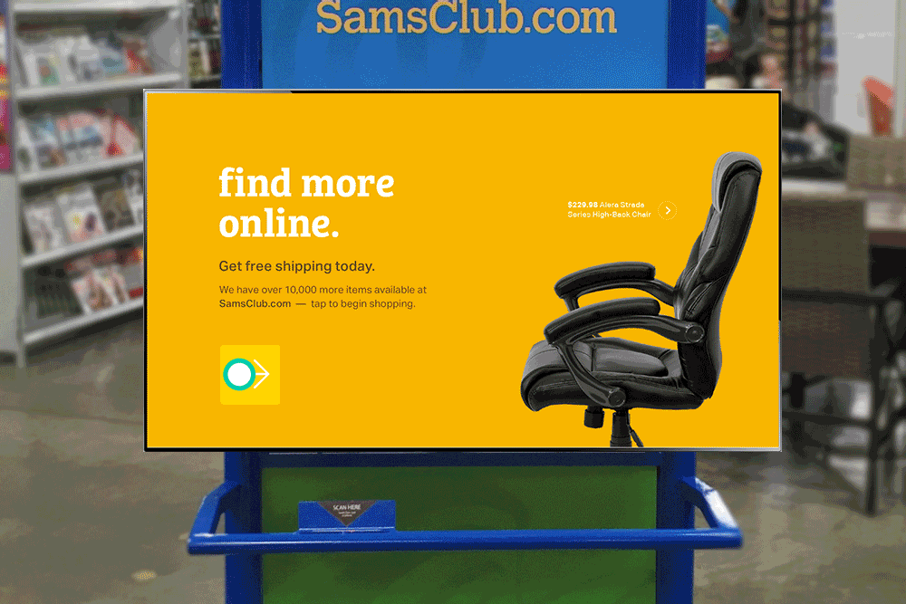
Kiosk In-Club. Attract screen animates to attract attention of members.
The primary role of me and my team was to build product specs with the product team, execute and understand competitive analysis of other kiosks, and to develop UX and interaction patterns that are intuitive and easily discoverable. While we were working to create an experience commensurate with the in progress reboot of samsclub.com, we paid special attention to the interaction and visual cues necessary to build a touch screen experience. The interactions and designs explore use of both the X & Y axis, but also the Z axis, allowing the user to navigate more fluidly. Finally, as no one in the company had experience building a kiosk experience, I took the lead with the program manager to select the kiosk screen size, resolution and final product installation.
The result is a seamless, highly creative execution of the samsclub.com extended assortment.
When starting to design the kiosk, there were a few core tenants we used as touch stones throughout the project.
1. MAKE IT FUN TO BROWSE
Browsing should be a light and enjoyable experience. Our members love the “treasure hunt” in-club, an experience we worked to replicate on the kiosk and new digital experiences.
2. MAKE IT FAST TO NARROW
Reduce layers of navigation and allow users to find products quickly. Our goal was to make shopping easier, something we heard could be a challenge in-club.
3. EASY HANDOFF TO MOBILE
While the kiosk provided a wide range of functionality, some transactions were best executed on a private device. Members could easily swap to their mobile device when necessary.
ATTRACT SCREENS
Curated product photography and a wash of cross fading brand colors invites users from a distance.A versatile format allows for a variety of opportunities to feature brands, collections, and individual products.
ATTRACT SCREEN CAROUSEL
The ‘Main CTA’ has a static message conveying the advantages of shopping online. It will also be large enough to read from afar. Tapping on this side of the screen takes the user to the top-level category being advertised.
ATTRACT SCREEN CAROUSEL
The carousel animates vertically where the user can swipe up and down to control which screen they are viewing. Items in the product/category carousel are centrally managed and editorially curated. Carousel content should focus on either a category, featured brand or single product.
CATEGORY SCREENS
A touch friendly experience that feels big and ‘tappable’ with simple icons and universal UI colors. A flexible grid system enhances structure and legibility without feeling rigid. Using the Z space to inform hierarchy.
There are two types of Category Screens: Clustered and Unclustered.
CLUSTERED CATEGORY SCREENS
Presents a category in an organized cluster with a max of 10 categories displayed.
Surfaces sub-categories within that category, ordered by largest to smallest.
Swipe CTA
An arrow prompting the user to swipe to start interacting with the kiosk.
Arrow is NOT persistent, once the user starts engaging/swiping the arrows disappears for the full session.
Provides quick and easy access for members who have a specific search in mind.
Introduces Sam’s Voice - Allows Sam’s Club to describe their perspective on that product category, the buyer’s point of view, etc.
NAVIGATION
A. Tappable, persistent Home CTA returns user to Top-Level Category Screen
B. Back Button
> Tappable and persistent on sub-category pages.
> Always navigates back to the last screen.
> Acts like browser back button, not necessarily following category hierarchy.
TOP LEVEL CATEGORY PAGE
A touch friendly experience that feels big and ‘tappable’ with simple icons and universal UI colors. A flexible grid system enhances structure and legibility without feeling rigid. Using the layering and depth to inform hierarchy.
TITLE CARDS
TITLE CARDS
A. Title Card
> Anchors the category.
> Swipe in either direction acts as primary navigation.
> All links tappable.
B. Sub-Category Links
> Includes sub-category name and number of products in that sub-category.
> Sub-category links are ordered and displayed by largest to smallest.
> Tappable CTA links to sub-category screen.
C. Product Cards
> Max of 5 product cards shown per category grouping.
> Products ordered and displayed by largest to smallest.
> CTA links to a product detail panel overlay.
D. ‘See-All ‘
> All cluster groupings end with a CTA to see all products within that category.
> Tappable CTA links to the category screen.

FILTERS
FILTER TYPES
A. Text Label
Displays item name and number of products that match that filter.
B. Price Range
Prices are grouped into ranges rather than displayed as sliders. Displays the price range and the number of products that match that filter.
C. Star Rating
Displays star rating and number of products that match that filter.
FILTER PANEL STATES
A. No Filters Applied All filter facets are collapsed. Tapping one of these facets will expand it.
B. Expanded Filter Facet
When a facet is expanded, the user can tap any filter to apply it. When tap another facet, it expands AND the first facet remains open.The user can scroll vertically through the list of facets and filters.
C. FILTERS APPLIED
When a facet is manually collapsed while filters are still applied, we display a summary of the applied filters within the collapsed facet row item. If the summary of applied filters exceeds the width of the panel an ellipses is displayed (e.g., Sofas, Sectional Sofas, Love Seats . . .).
FILTER TYPES
FILTER PANEL STATES
PRODUCT DETAIL
The product detail page should feel quick and informative. Balances the display of prominent product imagery and granular details. A split screen experience makes details more digestible for the user.
PANEL OVERVIEW
The product detail panel appears over the category page. From there, the user can tap to shift the panel over to expose more details.
A. Product Summary
Provides a quick overview of the product. Contains a rich carousel of images and other media, cumulative reviews and a brief product description. From here the user can save the product, or add to their cart to be purchased later.
B. Product Details - Provides detailed information about the product, specs, warranty, reviews etc.

PRODUCT SUMMARY ELEMENTS
Image Carousel * Product Flag * Product Name * User Rating * Product Description * Swatches * Price * More Info CTA * Purchase CTA * Close Button * Send Item to Phone * Email Item * Save Item to Online Account
360 PRODUCT SPIN & IMAGE BEHAVIORS
IMAGE BEHAVIORS
> 360 Spin - New controls appear to drag left and right, rotates product.
> Carousel Behavior - User may swipe through carousel or tap on icons below image {images, video or 360 spin}.
IMAGE BEHAVIORS
> Static Image Behavior - Zoom in and out with pinch and reverse pinch.
> Video Behaviors - Play/Pause Buttons, Play Head (Drag playhead to fast forward the rewind video).
> Close - Tapping the close button will return the user to the product detail panel.
ACT USER FLOW
The checkout process should feel simple and seamless. Making the purchase process more delightful with visual cues and moments of color. Using layers to inform hierarchy.

PURCHASE USER FLOW
Checkout has seven core components.
A. Scan Member Card
B. Enter Email Address - If member card sub-flow is necessary
C. Confirm Shipping Address
D. Update Shipping Address - If the user initiates
E. Confirm Shipping Method
F. Review Order
G. Prompt to Swipe Credit Card
H. Order Complete

WORKING PROTOTYPE OF KIOSK
Kate Addiego, Creative Direction
Nurun, Creative & UX Direction
Teri Durkin, UX Direction