

SamsClub.com Redesign—UX and Visual
OVERVIEW
Create a fresh, modern look and feel for the Sam's Club brand, specifically developing a more relevant and current digital experience that will speak to existing, and attract new, customers.
THE PROBLEM
Customers loved the in-club Treasure Hunt experience of Sam's, but did not have the same great experience online, therefore did not engage with the digital experience. In fact, we discovered that while >75% of Sam's Club shoppers shopped online on competitors' sites, only 4% of them shopped on samsclub.com. Customers felt the current site was too complicated, frustrating, impersonal and untrustworthy.
THE SOLUTION
To create a digital experience in line with Sam's Club Brand Attributes, such as being modern, fresh, authentic, trustworthy and engaging. The new experience, built with the customer at the center, will develop new capabilities for customization and will aim to reinforce the value of membership, savings and the rich assortment of products and services.
The customer experience was a significant consideration while redesigning the visual layer and brand, and was overhauled in this process.
CONCEPT ONE: SAVINGS MADE SIMPLE
This design is clean, direct and modern. It blends structured grids with strong fields of color to create a system that is easy to scan but friendly and engaging. It brings the product up front, as the hero of the website. The use of textural photos allows the user to feel as if they are inside of the experience, much as a member would browsing in the Club.
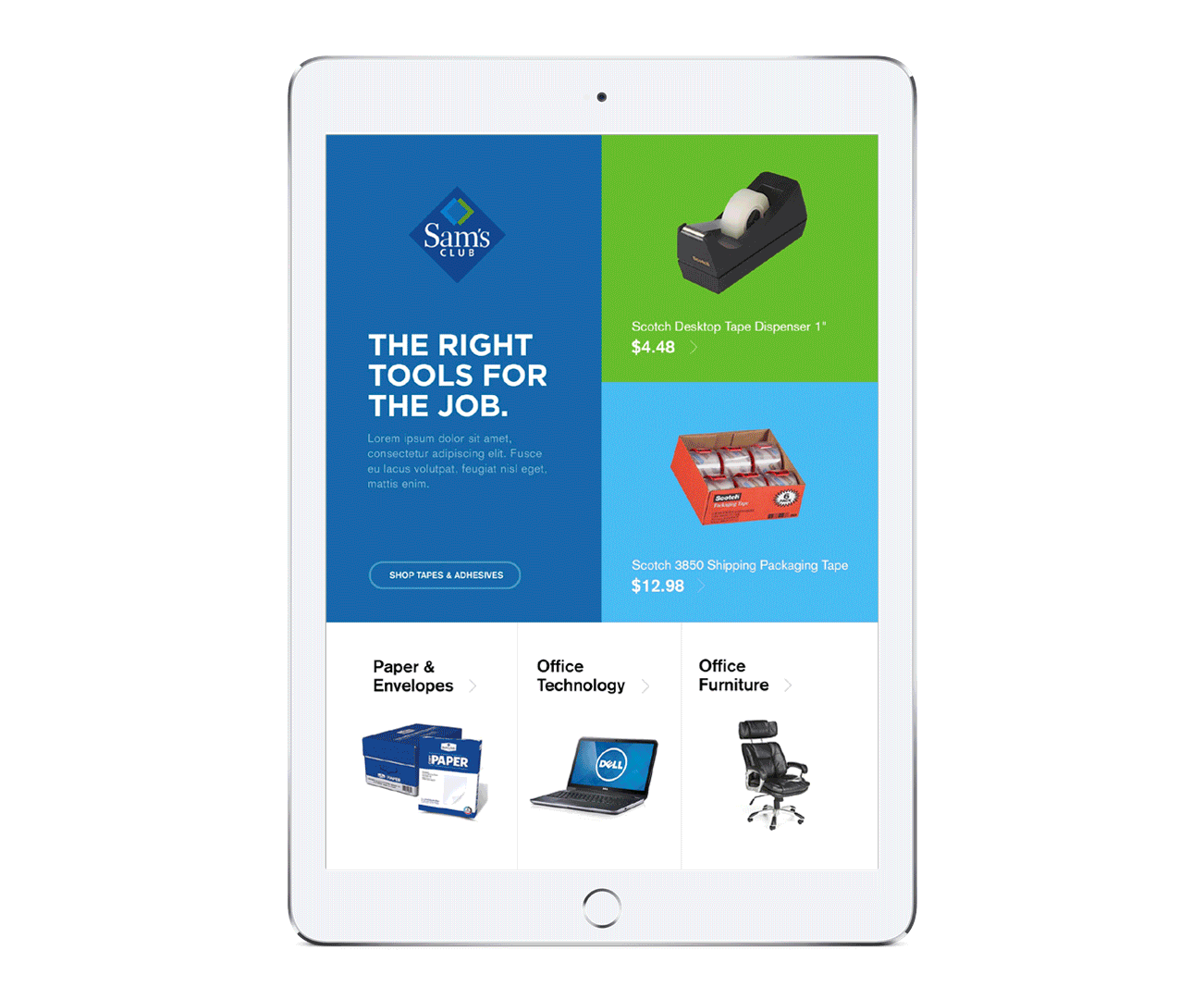

Direction One Kit of Parts
CONCEPT TWO: IN THE CLUB
This design is aspirational, classic, and has a more special quality to the way it presents the product. This concept relies on a more neutral palette, using pops of color to call out special offers and interesting details. The photography is situational, using a more natural style of photography to allow the user to imagine themselves in the experience.
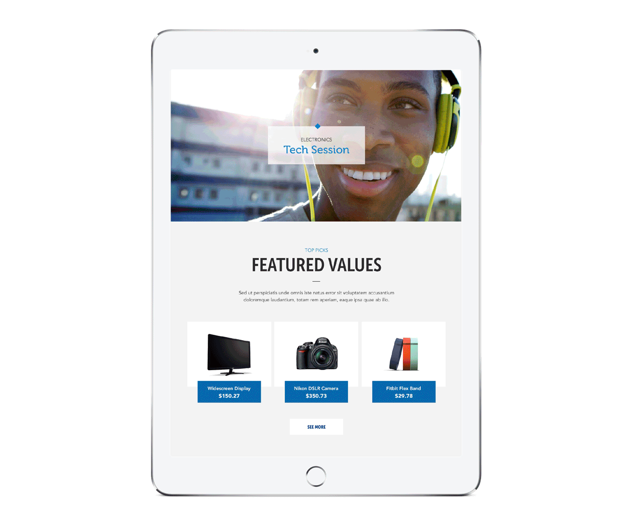
Direction Two Kit of Parts
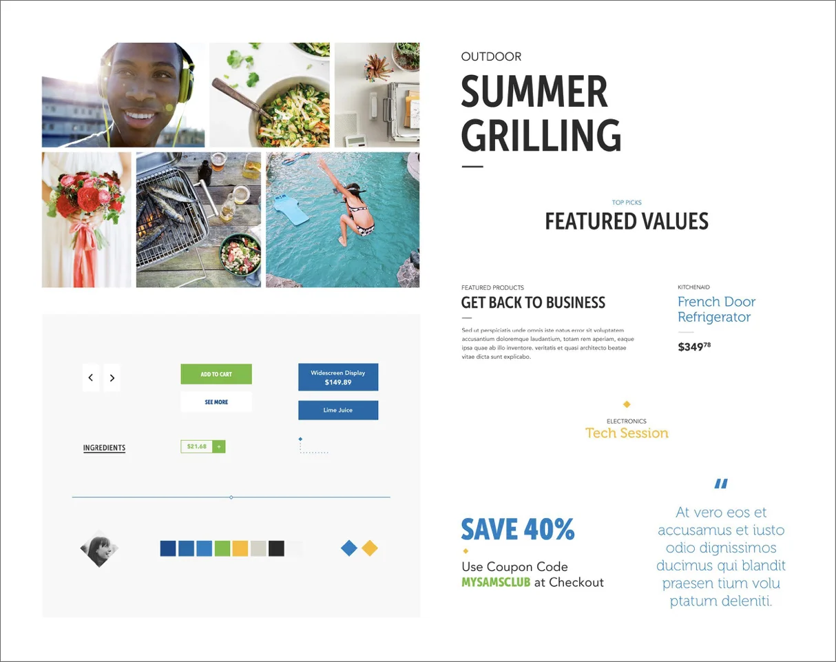
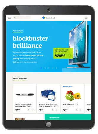
CONCEPT THREE: HAPPY TO HELP
This design features an offset grid that is playful and drives exploration. It brings a feeling of warmth and fun. The idea is for the designs and content to be more conversational and personal. The seasonal, extended color palette blended with the core brand color palette reflects the everchanging nature of the Sam’s Club product catalog. The photography is highly saturated, colorful, and shown in macro, relying on the art of the crop to bring the photography to life.
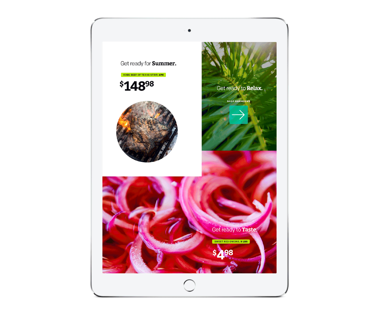

Direction Three Kit of Parts
TEST
USER TESTING
Following an extensive visual exploration, we tested two designs against the baseline of the current Sam’s Club look and feel.

Baseline
Concept Three: Happy to Help
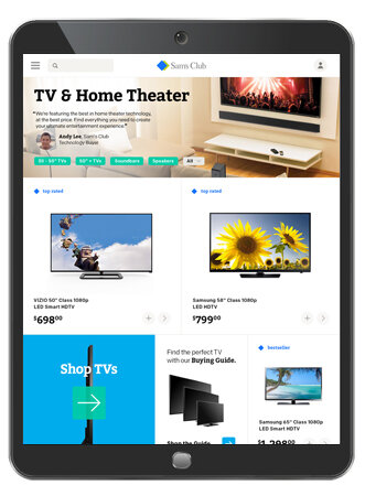
Category Page
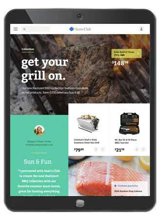
Collection Page
Product Detail Page
Creative Direction
KATE ADDIEGO
NURUN